Traffic Animation (Animated Links)
Network Weathermap NG can animate small moving dots along a link to show traffic direction and intensity at a glance — a firewall pushing traffic to a core switch reads as a stream of dots flowing that way, faster and denser as the link fills up.
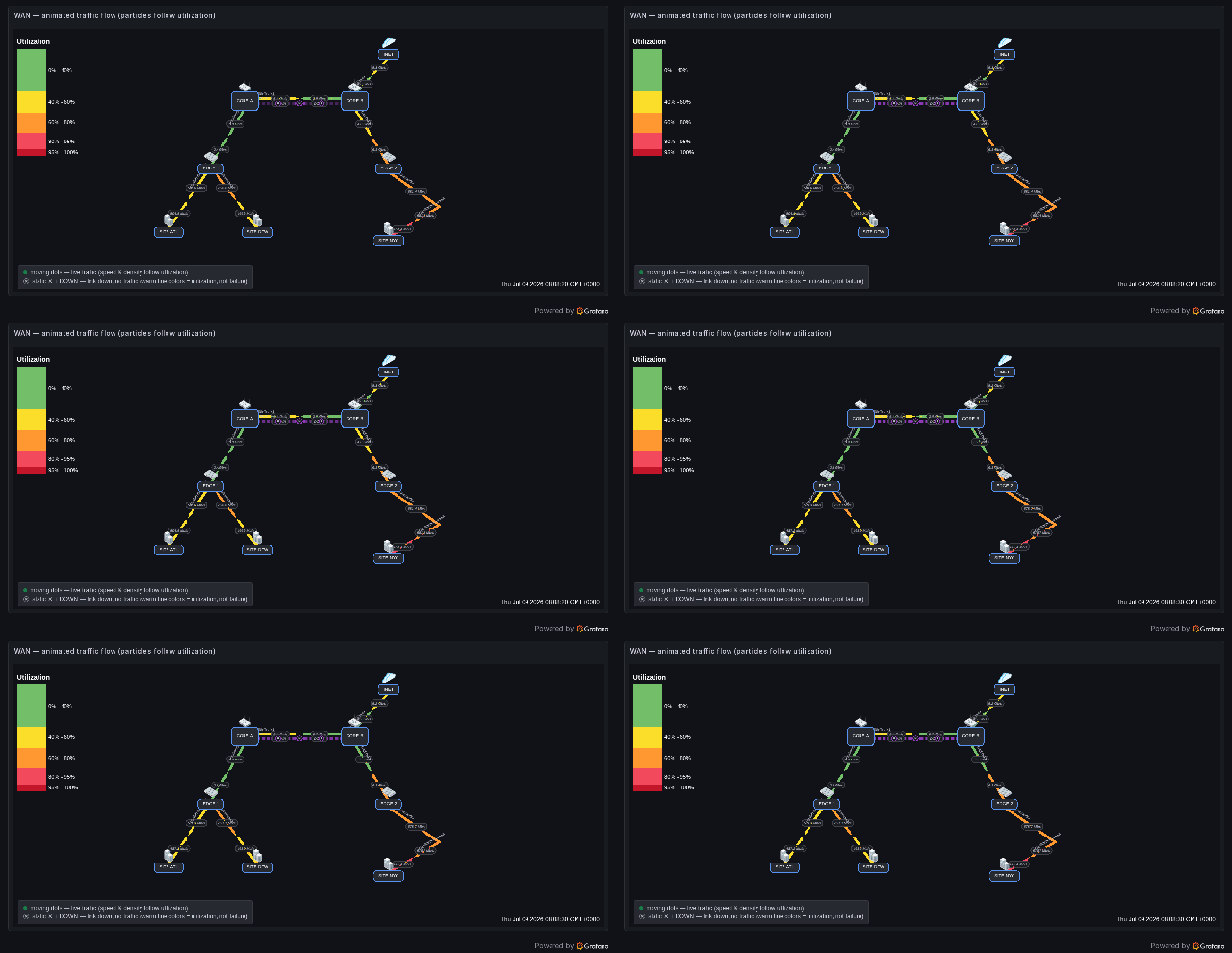
The WAN Demo — Animated Traffic Flow dashboard: dots stream in both directions on each active trunk; speed and density follow utilization; the CORE-A ↔ CORE-B pair shows a down trunk with static ✕ badges and DOWN labels instead of motion.
This is a visualization, not packet capture
The dots are symbolic. They are derived from the numeric metrics your Grafana queries already return (bits/sec, utilization %). They do not represent individual real packets, and the plugin does not capture, inspect, or replay traffic. There is no tcpdump, PCAP, DPI, NetFlow/sFlow/IPFIX collector, or custom data source involved — it only animates values Grafana hands it. See Scope boundaries.
Animation is disabled by default. Existing dashboards render exactly as before until you turn it on.
Where the numbers come from
Animation reuses the same A-side / Z-side values that already color your links — no new queries are required. A common, clean path for interface counters is SNMP → Prometheus:
 Switch / Router / Firewall
   → SNMP (ifHCInOctets / ifHCOutOctets / ifOperStatus …)
     → snmp_exporter (if_mib module)
       → Prometheus  (stores the time series)
         → Grafana query  (rate(...) * 8  → bits/sec)
           → Network Weathermap NG  → animated dots on the link
Metric availability depends on your device
SNMP interface metrics require the snmp_exporter if_mib module or equivalent. Exact counters (ifHCOutOctets, ifOperStatus, ifOutErrors, …) depend on the device and SNMP configuration.
Works with any Grafana data source
Animation is data-source-agnostic — it reads whatever numeric series already drive your links, so it works identically no matter where the numbers come from. You need, per link side, a traffic value and a bandwidth in the same unit, and optionally a status series for the down-link ✕ treatment. The binding rules (display names, legends, per-source quirks) are the same as for any weathermap link — the full reference is in Data Sources.
Two rules that trip people up:
- Value and bandwidth must share a unit. Utilization is a plain
value ÷ bandwidth— no unit conversion. So a bits/sec value needs a bits/sec bandwidth; a packets/sec value needs a packets/sec capacity. If your query already returns a utilization percentage (e.g.50), set the side Bandwidth # to100so50 ÷ 100 = 0.5. Mixing units (a50percent value against a10000000000bit bandwidth) yields ≈0 and no dots. - The status series must be
1= up /0= down (the plugin treats0or absent as down and any non-zero as up). Enum metrics are not 1/0 — normalize them (see the SNMP note below the table).
| Data source | Traffic value (per side) | Status series → normalized to 1/0 |
|---|---|---|
| Prometheus (SNMP) | rate(ifHCOutOctets{instance="core-switch",ifName="Gi1/0/1"}[2m]) * 8 |
ifOperStatus{instance="core-switch",ifName="Gi1/0/1"} == bool 1 |
Prometheus (Linux node_exporter) |
rate(node_network_transmit_bytes_total{device="eth0"}[2m]) * 8 |
node_network_up{device="eth0"} (already 1/0) |
| InfluxDB (Flux) | from(bucket:"wm") … filter(r._measurement=="wm_link_bps" and r.direction=="tx") |
… r._measurement == "wm_link_status" |
| Elasticsearch | Average of bps, Lucene device:core-a AND direction:tx |
Max of status, Lucene link:"core-a<->edge-1" |
| Zabbix | Item Interface ge-0/0/1: Bits sent |
Item Interface ge-0/0/1: Operational status |
Bind these in the link editor exactly as you would for a non-animated link: A/Z Side Query = the direction's traffic value, A/Z Bandwidth # (or Bandwidth Query) = the capacity, and Status Query = the operational status. Turn animation on, and the same numbers that color the link now also drive its dots. See each source's legend/alias and known deviations in Data Sources.
SNMP ifOperStatus is an enum, not 1/0
IF-MIB ifOperStatus returns 1 = up, 2 = down (and 3 testing, 7 lowerLayerDown …). Fed raw, a down interface reports 2 — non-zero — so the plugin reads it as up. Normalize it to 1/0 with == bool 1 (as in the table), or with a recording rule. The same applies to Zabbix's Operational status item and any other enumerated status metric — map the "up" value to 1 and everything else to 0.
Bandwidth is what turns a value into a speed
Utilization = value ÷ bandwidth. Without a bandwidth on a side, that side resolves to no dots (it can't compute a speed) — so always set A/Z Bandwidth # or a Bandwidth Query on links you want to animate, in the same unit as the value.
How to make links animate
1. Turn on animation (panel level)
Open Panel options → Animation:
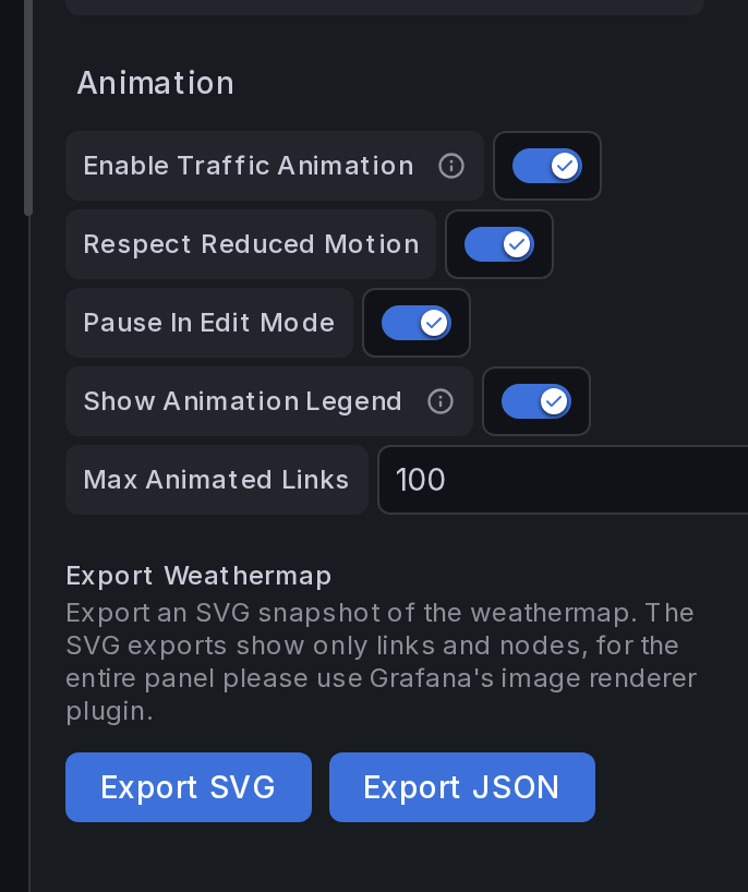
| Option | Default | What it does |
|---|---|---|
| Enable Traffic Animation | Off | Master switch. Off = nothing animates. |
| Respect Reduced Motion | On | AND-gated with the viewer's OS prefers-reduced-motion. When the OS asks for reduced motion, dots don't move. |
| Pause In Edit Mode | On | Stops animation while you're editing the panel, so it doesn't distract while you place nodes. |
| Show Animation Legend | On | Shows the built-in legend (moving dot = live traffic, ✕ = down). Rendered only while animation is active. |
| Max Animated Links | 100 | Hard cap on how many links animate at once, protecting large maps. |
2. (Optional) override per link
Each link has a Traffic Animation control in the link editor:
| Per-link value | Behavior |
|---|---|
| Inherit (default) | Follows the panel master switch. |
| Enabled | Animates this link even when the panel switch is off — good for spotlighting one flow. |
| Disabled | Never animates this link, even when the panel switch is on. |
That's it — with a side query, a bandwidth, and the switch on, the link starts flowing. To make a link animate you need no new fields: the A/Z values and bandwidths you already set drive everything.
What the animation shows
Direction
The plugin already models each link as two sides. Animation follows the same model:
- A-side value > 0 → dots move A → Z
- Z-side value > 0 → dots move Z → A
- both > 0 → dots move both ways
- Single-direction links animate only A → Z
Speed and density (utilization)
If a side has a bandwidth, the plugin computes utilization and scales the dots — symbolically, not per-packet:
utilization  = max(0, value) / bandwidth      (clamped to 0…1)
speed (px/s) = 20 + sqrt(utilization) * 100
dot count    = 1 + round(utilization * 7)
The sqrt easing keeps light traffic visible without letting a saturated link race off the screen. Rough feel:
| Utilization | Result |
|---|---|
| 0% | no dots |
| 1–10% | 1 slow dot |
| 10–40% | 2–3 dots |
| 40–70% | 4–5 dots |
| 70–90% | 6–7 dots |
| 90%+ | dense, fast, warning-colored dots |
Bandwidth is required for scaling
Utilization needs a capacity. Set A/Z Bandwidth # (or a Bandwidth Query) on the link. With no bandwidth (or zero), the side resolves to no dots rather than guessing.
Color
By default each dot inherits the link's threshold color for its current utilization — so a link going yellow → orange → red carries dots of the same color. No separate configuration.
Down links
Give a link a Status Query. When it resolves down (value 0 or absent):
- traffic cannot flow, so the dots are replaced by three static ✕ badges along the link (neutral disc + down-colored ring + contrast glyph — deliberately distinct from the red end of the utilization ramp),
- both side labels read DOWN instead of a stale throughput number (the hover tooltip still shows the real series and its history so you can see the moment of collapse).
The DOWN treatment is part of animation
The static ✕ markers and the DOWN labels only apply to links that participate in animation (panel switch on, or per-link Enabled). A map that never enables animation keeps its existing down-link rendering (dashed line + last value) unchanged.
Legend
While animation is active, a small built-in legend explains the glyphs. It renders only when animation is on for the panel (or a link overrides to Enabled), never on a non-animated map, and it can be hidden with Show Animation Legend.
Timeline replay
When the Timeline Slider is scrubbed into the past, animation pauses — the map is replaying a historical snapshot, and static values read more clearly than motion. Press Live to resume the flowing dots.
MVP limitation, by design
Animating historical rates as you scrub (dots that speed up/slow down to match the replayed moment) is a planned enhancement, not a bug. Today, scrubbing = paused animation; live = flowing animation.
Accessibility & performance
Animation is built to stay out of the way:
- Reduced motion — honored by default (AND-gated with the OS preference); no flashing, no high-frequency blinking.
- Fully optional — off by default, disablable globally and per link, paused in edit mode.
- No React re-renders — dots are native SVG
<animateMotion>elements. The browser's compositor animates them; the panel does not re-render per frame and uses norequestAnimationFrame. - Bounded — the Max Animated Links cap limits how many links animate at once.
Scope and non-goals
This feature only visualizes numeric metrics already returned by Grafana queries. It intentionally does not implement any of:
packet capture · tcpdump · PCAP parsing · deep packet inspection · payload inspection · NetFlow / sFlow / IPFIX collection · packet replay · a custom packet-capture agent · a custom Grafana data source
See the broader scope boundaries for how this sits alongside the plugin's other visualization-only features.
Try it live
The WAN Demo — Animated Traffic Flow dashboard ships with the testing stack:
npm install && npm run build
cd testing && docker compose up --build
Open http://localhost:3101 → Dashboards → WAN Demo — Animated Traffic Flow. The simulator produces low / medium / high / idle / bidirectional / down link series so every animation state is visible, including a permanently-down trunk with static ✕ badges next to an animated one.